its own
alphabet
Starting now, we have a new name: The Musical Instrument Fund. This also means a new visual identity. We are delighted with the unique, custom alphabet that Atelier René Knip created for us. “The typeface captures the richness of sound in music.”
loud and clear
In last year’s magazine, you read in an interview with Director Manon Veenendaal about our new strategy, which is better suited to the current zeitgeist while still staying true to our values. Among the goals and initiatives we took on this year was a new name. A name we no longer abbreviate, because there are dozens of other organizations with the abbreviation NMF. From now on, we’re called—loud and clear—Het Muziekinstrumentenfonds. That name says exactly what we do and what we stand for.
cut
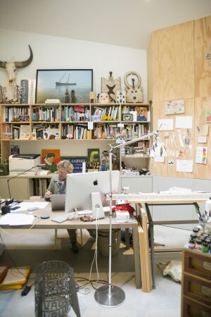
After a careful selection process, we ultimately chose Atelier René Knip to design our new brand identity. René is the best fit, both artistically and in terms of content. Just like us, he values a personal approach and craftsmanship. That depth and sensitivity are reflected in the beautiful typeface he designed for us, which we’re incredibly proud of.

Browsing Graphics
René Knip: “While sketching, I set out to find a musical typeface with a strong identity of its own. Since musical instruments have been built over the past few centuries, I thought it would be nice to explore our rich calligraphic and typographic heritage from a graphic design perspective. Stylized elements and flourishes on the letters—which actually stem from the calligraphic, flat nib—give the typeface a dynamic look.
A second source of inspiration in the design of the font is what are known as ligatures. These combinations of two letters were once technically necessary. Because printed material was set for centuries using individual lead or wooden letters, the spaces between some letters became too large. Letter combinations were then set on a single plate. But ligatures were also very often elegant and distinctive.
The logo type plays with these classic elements, but at its core it is energetic and modern. It’s a bit like how a fashion designer might incorporate the boning from a historical hoop skirt as a source of inspiration into a contemporary garment. All in all, the fund’s logo evokes a sense of sound and movement and captures the richness of music.'
